Tuesday, December 7, 2010

Lab 8 : Mapping the Census

The Census Map Series

In this final lab, we were asked to map Black population, Asian population and Some Other Race Alone in the United States using 2000 Census data from the U.S. Census Bureau. Each thematic map in this series is a chloropleth map, using 5 different classification colors and the Quantile classification system. Each map gives the race population that it maps in its Title and Subtitle, a legend showing the percent of the population corresponding to each color, and metadata (brief summary of the map's Datum, Projection and Source.  Overall, we can see from this series of maps the unique demography of Black population, Asian population and Some Other Race Alone. Furthermore, it becomes evident that each portion of the population is most present in specific regions of the United States.

The first map (Fig. 1) shows Black alone population in the United States in 2000. From this map, we can see that a large number of the Black population is located in the Southern United States. This information is very helpful for policy makers, specifically in this case, for policy makers for the Southern states. We can also see in this map that the Black population is rather sparse in the North Mountain states of Montana, Wyoming, North and South Dakotas. This might tell users of this map about the history and culture of these regions, also about what types of decisions the policy makers in this region might be making which affect population.
Fig. 1
The second map (Fig. 2) shows Asian alone population in the United States in 2000. This map reveals that the Asian population in the United States is fairly spread out. There exists a large number of members of the Asian population on both the West and the East Coasts, specifically around Southern California, Southern Florida and the far North-East. This characteristic showing population location shows users of this map that policy makers in these regions of the United States are faced with making decisions that will affect the large Asian population of their county or state. This map will also help to inform policy makers of these regions about the percent of the population in their county that is a member of the United States' Asian population.
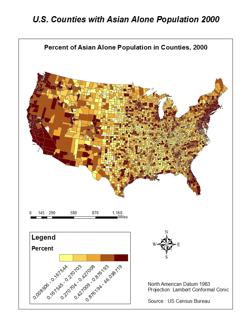
Fig. 2
The third map (Fig. 3) shows Some Other Race alone population in the United States in 2000. Some Other Race Alone means that the individual filling out the census marked 'Other' race instead of White, Black, Asian, Native American or Hispanic/Latino. This map shows that there is a great deal of diversity in terms of races not represented by the specific race categories offered by the U.S. Census in the Western and South-Western United States and less so in the South, North and Eastern United States. One reason for this could be that the regions where there is more diversity is because they are generally more newly developed regions of the United States, where perhaps diversity is more easily accepted.
Fig. 3
My Overall Impressions of GIS

GIS is both extremely frustrating when it is not working smoothly for you, and extremely rewarding once you succeed at making a clear, accurate and interesting map. I am very happy that I took Geography 7 because I have certainly learned a valuable skill, and one that I will pursue further. I am enrolled in Intermediate GIS for Winter quarter and I plan on taking Advanced GIS in the Spring. While I believe that I have been exposed to a variety of the options available in ArcGIS, I know that there is much for me to learn. Part of what is necessary next for me to learn are specific techniques and how to execute them, and another part of it is simply becoming more acclimated to the software and continuing to practice with it.

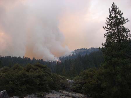
I enjoyed how each lab focused on a different aspect of ArcGIS, honing in on a certain capability with the software and focusing on it. I think that my favorite lab exercise was Lab 7 : Mapping the LA Station Fire. I enjoyed this lab because there was lots of room for creativity and we learned the value technique of extracting information from a broader file, such as LA county from Counties in California or the Fire perimeter from LA County. I found those techniques to be very useful and interesting to incorporate with maps, especially in an inset map.

Sunday, November 21, 2010

Lab 7 : Station Fire

Vegetative Regrowth after LA's Station Fire

This paper uses GIS to map and analyze the fire that broke out in August-September 2009 in Los Angeles County. The fire was the 10th largest to break out in LA County since 1933, scorching 160,557 acres (LA Times). A fire of such proportions will inevitably have a strong impact on the local ecosystem. This paper will examine such an impact by mapping the fire expansion zone and "Special Ecological Areas" in LA county to determine if any of these unique ecological areas were burned during the fire, and if so, what it may mean for the process of vegetative regrowth in the area.


Fire Progression
The fire (the majority of which occurred within the Angeles Forest National Park) lasted from  August 26 – October 16. In each of the maps below, three dates have been chosen which show three major progressions of the fire (August 29, August 30, September 2, 2009). The  Refer to the map below to see the area impacted by the Station fire and a Digital Elevation Model of LA County, showing the fire's progression.


So what is a "Special Ecological Area"?
Special Ecological Areas are administered by the National Park Service, and they are considered to be "representative ecosystems"; those with natural hydrology, geology and native wildlife, which have been "designated for intensive [environmental] management," such as the control and removal of exotic species (National Park Service). The state of California encompasses hundreds of designated Special Ecological Areas, covering hundreds of thousands of acres. The map to the right shows a close-up of Special Ecological Areas in and around the fire boundaries. The inset map shows all of the Special Ecological Areas within LA County.


Were any Special Ecological Areas harmed by the Station fire?
Looking at the map below, we see that two separate Special Ecological Areas endured burning, and that the total acreage affected is : 4,072 acres.

What will that mean for vegetative regrowth in these sensitive areas?

Well, fortunately, the native flora found in these Special Ecological Areas are designed to withstand and thrive with fire. In fact, within weeks after the Station fire, the hardwood trees and shrubberies started to regrow from their roots. However, the softwood trees (ie. pines and furs) will take much longer to re-establish themselves (Stefaan Lhermitte, et al.). Softwood trees require heat to open the cones and release the seeds. In fact, many native flora to Southern California require heat for seed germination to occur. If there is adequate water moisture, we should even see many wildflowers blooming in the areas next Spring (J. Timothy Tunison, et al.).


Moreover, seeds that have been lying dormant for years have now been exposed to sunlight, which will help them to germinate, creating new growth. Ash from the fire will also have a positive impact; for ash provides phosphorous, which is a necessary part of fertilizer, stimulating strong roots and blooms (National Science Foundation). Burrowing animals, which mostly survived the fire, churn the ash into the soil, helping the ash penetrate the mineral-poor soil. The years after a fire often show the most beautiful and spectacular vegetation because of all of these factors coming into play, creating a very lush and healthy vegetation.


Main Impacts of Station Fire on Vegetation
The main problem with vegetative regrowth is the loss of conifers in the forest because they must now struggle as seedlings (Stefaan Lhermitte, et al.). They will take a few decades probably to be fully replaced. Also, many animals will have trouble finding food if the species of plants and trees that they eat are having trouble regrowing. Seedlings always have trouble growing because they are weak and preyed upon by animals such as deer. If there is a drought, the seedlings will have trouble as well.

Overall for vegetation, fire can bring new life and growth to the forest, but it is also very detrimental. The LA County Station fire was a huge fire that may have burned a relatively small acreage of Special Ecological Areas, but still had an immense impact on other vegetative areas, let alone populated areas, and we will continue to see its effects many years into the future.

California's Vegetation
In the map below, we can see many different types of vegetation in California. In the LA County region, we see that the main types of vegetation are: chaparral, lower Montane, California grassland, and juniper pine woodland.

Taken from Humboldt State University Library, 22 November 2010: http://www.californiaherps.com/images/vegetationmapjeaster.jpg

References
Ari B. Bloomekatz and Carla Rivera, "Canyons become battleground in Station fire." LA Times, September 2, 2009.

J. Timothy Tunison and Charles P. Stone. "Special Ecological Areas." Hawaiian Ecosystems at Risk Project. Accessed November 20, 2010. http://www.hear.org.

National Park Service. "Special Ecological Areas:  Priority Places for Intensive Management." Last modified 12 June 2001. http://www.nps.gov/archive/redw/sea.htm.

National Science Foundation. "Rising from the ashes: Forest fires give way to new growth." Last modified 18 May 2007. http://www.sciencebuzz.org/buzz_tags/forest_regrowth.

Stefaan Lhermitte, et al., "Assessing Vegetation Regrowth after Fire Based on Time Series of Spot Vegetation Data." IEEE Xplore (2007). Accessed November 19, 2010. http://ieeexplore.ieee.org

Big Meadow fire, August 27. Taken from Wildfire Today, 22 November 2010: http://wildfiretoday.com/2009/08/page/2/

Tuesday, November 16, 2010

Lab 6 : DEMs in ArcGIS

I chose to do my DEM of California's largest island: Santa Cruz Island, one of the Channel Islands off the coast of Southern California. The reason that I chose an island is that I thought that perhaps its DEM would look particularly interesting, and I think that it does. For example, for the most part, the ocean surrounding the island is completely pink, which according to the legend, means it has a value of roughly -3.75 meters. The boundary of the island is, therefore, very clearly marked, and we see that the ocean here is below the average sea level. Also, we can see that the inner most parts of the island have the highest elevations. According to the Channel Islands National Park website, Santa Cruz island contains two mountain ranges, the highest peaks on the islands (rising above 2,000 feet), a large central valley/fault system, and  deep canyons. These features are quite clear when looking at my shaded relief model.

Extent Information:
Top 34.0949999991
Left -119.940555555
Right -119.503055555
Bottom 33.9383333324

Spatial Reference: 
GCS North American 1983

3D Image


Tuesday, November 2, 2010

Lab 5 : Projections in ArcGIS

Map projections are necessary for creating maps. A map projection involves the process of representing the surface of a shape (ie. sphere, cone, cylinder, etc.) onto a plane. However, in this process distortions are inevitable. Below are some examples of different map projections, showing how certain projections are more useful for certain activities.


The two above maps (Gall Stereographic and Mercator) are examples of conformal map projections. Conformal map projections preserve angles, but have the tendency to distort area and distance. The reason for this is that in trying to preserve 90 degree angles, it ends up giving a skewed sense of distance, which is evident in the reported distances from Washington, D.C. to Kabul, Afghanistan. Conformal maps are the type of maps most commonly used in activities, such as navigation.


These two maps are examples of Equidistant Map Projections. They are the Conic Equidistant and Sinusoidal Equidistant Projections. These projections preserve distance on the map between any two points. They take into account the curvature of the earth, and therefore, represent distance quite accurately, as shown by the distances reported between Washington, D.C. and Kabul, Afghanistan.


These two map projections (Mollweide Equal Area and Cylindrical Equal Area) are examples of Equal Area map projections. This means that they do a very good job of preserving area on a map. Equal Area map projections are useful when determining the area of two features, such as wetlands. Having an accurate representation of a wetlands area is crucial for many aspects concerning it, such as conservation policy.

Overall, maps can differ greatly depending on the map projection that is used. This is because the earth is not a perfect sphere and so in preserving one aspect, we distort another. That means that different map projections will be useful for different uses.

Lab 4 : ArcGIS


This lab was my first experience with ArcGIS, specifically ArcMap. Overall, I am very impressed by all that ArcGIS allows a user to do. At first, it was frustrating because I didn't understand why I was doing all of the actions that I was doing. It was a lot of button pushing without comprehending the whole picture. My second time through the tutorial went more quickly and smoother because I was beginning to understand the 'why' behind my actions. This exercise, and its example of proposed airport expansion, made me realize how much GIS technology must be used in all sorts of fields to accomplish analyses that have just recently become a possibility for non-governmental agencies. And, inevitably, with this immense potential comes pitfalls.

ArcGIS allows users to make accurate, professional, detailed, and well organized maps very quickly. Users are able to run statistical analyses and then make tables and graphs to more clearly represent these statistics.  This means that statistical data represented geographically is becoming more prevalent and easier to come by. The upside to this is that it allows people to categorize areas based on different criteria quickly, which can be useful for all sorts of policy and planning,

However, there are also downsides to the prevalence of these types of maps. It means that the people who possess them also possess a knowledge that others may not, and that means that they have potentially more power and control. After all, the most basic maps were simply a way for humans to better understand and control their environment. This can lead to problems concerning equality and fairness. Another problem that may arise over such mathematical representations of the real world is that the real world is not actually as clearly demarcated as it is shown to be on a map. Therefore, while a map can be very useful in showing a certain perspective, one should not rely on a map as the only perspective.

Another important question that arises regarding GIS technology, such as ArcGIS, is the ability one has to manipulate information to create a map with an intentionally skewed representation of the world. This is a problem to be considered regarding all maps, but as maps become more prevalent thanks to GIS so does the occurrence of such practices. Therefore, a map reader must always keep in mind that a map may not always be telling the entire story. Despite these pitfalls, GIS opens up many possibilities and is a valuable resource to society, and it will be very interesting to see how it continues to develop and change the world we live in.

Tuesday, October 12, 2010

Lab 3 : Neogeography

Here is my map of Lyon, France, which highlights where to discover the Roman and Renaissance past of the city, the most delicious gastronomic restaurants & cafés, and the best entertainment. All of the locations are from my own experience and memory as a student living in the city for a year.


View Abroad in Lyon, France in a larger map

This was my first time making a map online, and it was interesting to be able to recreate a place anywhere in the world online for others to experience (with photos, videos, and URLs). My map is like the ultimate photo album/scrapbook. Instead of just having photos and perhaps some hand-written descriptions of the places I discovered while abroad, I can add the geographic locations of each photo and videos as a way in which to interact with the places even after returning home. I can even show distances between places and map out walking routes and areas on the map. If I had seen a map like this before leaving for Lyon, I think I would have really appreciated it. But at the same time, it would perhaps have taken the fun out of discovering these places on my own, spontaneously.

Despite the possibilities Google Maps opens up, I found some problems with it. For example, the walking route is automatically drawn and it would not select the streets I wanted it to, and certain places (ie. cafés, landmarks) are marked on the Google Map but I have no idea how they were chosen and I think that many important places are left out while other not-so-important places are included. More importantly, the Google map doesn't show topography, which is really important in a city like Lyon, where the city is dominated by two large hills. These two hills are important to the city's past; combined with two prominent rivers, these topographical features played an important role in the choice of many ancient peoples to live there, including the Gauls in the 5th century BC. Due to both the possibilities and problems of Google Maps, I think there have been and will continue to be many consequences, both good and bad. One of the biggest consequences I see is that as more information is put online, less of it will exist in a tangible form. For example, sometimes I would prefer to sit down with an actual book than read it online. The same can go for a photoalbum or trip diary. I think that humans can find technology novel and appreciate it, but I think that we will still sometimes want to experience things tangibly, in reality, and so it's important to maintain a balance with the cyber world and reality.

Tuesday, October 5, 2010

Lab 2 : Topographic Maps

1. What is the name of the quadrangle?
Beverly Hills Quadrangle.
2. What are the names of the adjacent quadrangles?
1. Canoga Park, 2. Van Nuys, 3. Burbank, 4. Topanga, 5. Hollywood, 6. (Ocean), 7. Venice, 8. Inglewood.
3. When was the quadrangle first created?
1995.
4. What datum was used to create your map?
North American Datum of 1927 (NAD 27) and North American Datum of 1983 (NAD 83) [horizontal data] and Geodetic Vertical Datum of 1929 [vertical datum].
5. What is the scale of the map?
1 to 24,000.
6. At the above scale, answer the following:
a) 5 centimeters on the map is equivalent to how many meters on the ground?
x = 5cm * 24,000
= 120,000 cm. / 100
= 1,200 meters.
b) 5 inches on the map is equivalent to how many miles on the ground?
x = 5 in * 24,000
= 120,000 in.
120,000 in. / 12 in. = 10,000 ft.
10,000 ft. / 5,280 ft
= 1.894 miles.
c) one mile on the ground is equivalent to how many inches on the map?
1/24,000 mi = 1 mi on the ground
(1/24000) * 63360 in.
= 2.640 inches.
d) three kilometers on the ground is equivalent to how many centimeters on the map?
1km = 1000 m = 100,000 cm
100,000 cm * 3
= 300,000 cm / 24,000
= 12.5 cm.
7. What is the contour interval on your map?
20 feet.
8. What are the approximate geographic coordinates in both degrees/minutes/seconds and decimal degrees of:
a) the Public Affairs Building;
Latitude - 34º4'28" N, or 34.0748º
Longitude - 118º26'35" W, or -118.439º
b) the tip of Santa Monica pier;
Latitude - 34º0'27" N, or 34.0075°
Longitude - 118º30'0" W, or -118.5°
c) the Upper Franklin Canyon Reservoir;
Latitude - 34º7'16" N, or 34.1211º
Longitude - 118º24'35" W, or -118.4097º
11/2 inches = 2'30" or 150"
1/2 inch (UFCR) = x"
150"/2 in. = 75" in. * (2/11 in.) = 13.6363"
34º7'30" - 13.64" = 34º7'16"
D + (7/60) + (16/3600) = 34.1211º
9. What is the approximate elevation in both feet and meters of:
a) Greyston Mansion (in Greystone Park);
580 ft.; 176.784 m.
1 ft = .3048 m
580 ft * .3048 m.
= 176.784 m.
b) Woodlawn Cemetery;
140 ft.; 42.672 m.
1 ft = .3048 m
140 ft. * .3048 m.
= 42.672 m.
c) Crestwood Hills Park;
680 ft.; 207.264 m.
1 ft = .3048 m
680 ft. * .3048 m.
=207.264 m.
10. What is the UTM zone of the map?
Zone 11.
11. What are the UTM coordinates for the lower left corner of your map?
361.5 Easting
3763 Northing
12. How many square meters are contained within each cell (square) of the UTM gridlines?
1000 m. * 1000 m. = 1 million sq. meters.
13. 
14. What is the magnetic declination of the map?
 +14 degrees.
15. In which direction does water flow in the intermittent stream between the 405 freeway and Stone Canyon Reservoir?
The water flows South.
16.